Blazor apps are based on components. A component in Blazor is the atomic unit of composition for any UI element, such as a page, control, dialog, or data entry form.
Components are .NET C# classes built into assemblies. They can:
- Define UI rendering logic.
- Handle user events.
- Be nested and reused.
- Be shared and distributed as Razor class libraries or NuGet packages.
The component class is usually written in Razor markup with a .razor file extension. Razor allows you to combine HTML markup and C# code in the same file with IntelliSense programming support in Visual Studio. Components are used specifically for client-side UI logic and composition.
Blazor uses normal HTML tags for its UI composition. So folks with familiar with HTML and CSS will find the component UI layout very familiar.
To begin looking at components, we must have a Blazor project. Either open an existing Blazor project, or please follow the steps in the How-To: Create Blazor WASM Project article to create a new one. For this article, we called the project: Blazor.HowTo.
Create a New Component
To create a new component from scratch:
- Create the Components folder in the Blazor-HowTo project. We want to keep our components in a known location. This is a common location or some teams also use the Shared folder in this project.
- Right-click on the Components folder.
- Select the ‘Add > Razor Component’ menu item.
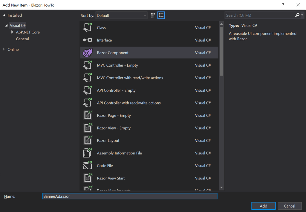
- Name the component with a descriptive name: ‘BannerAd.razor’ in this case. But this name can be whatever name we want to use for our component. Use a descriptive naming convention so other team members know the intent of each component.
- The component markup generates a C# class at build-time, so the component naming convention must follow a class’s naming convention and be unique within a given namespace.
- Notice that the ‘Razor Component’ item is selected in the main listview.
- Finally, click the ‘Add’ button.
This will produce our new component file and open it in the code editor.
<h3>BannerAd</h3>

@code {

}
We can see that the Blazor component is just simple, raw HTML markup (of a header with the component name), and an empty @code section which will eventually hold our C# code.
Let’s make this component a little more compelling by providing the markup for a hard-coded, static banner ad.
<div class="col-12 pt-1 rounded border" style="background-color: lightgray">
    <a href="https://docs.microsoft.com/en-us/aspnet/core/blazor/?view=aspnetcore-5.0">
        <img class="float-left mr-2 mt-2 align-items-center" src="/images/blazor-ad-image.png" />
    </a>
    <h5><strong>Learn About Blazor!</strong></h5>
    <p style="font-size: small">
        Learn about the .NET 5 technology for building single page applications (SPAs).
        Transfer your knowledge of C# and .NET into the exciting realm of frontend development.
    </p>
</div>

@code {

}
This file creates a reusable component that contains a thumbnail image, a title, descriptive text, and a navigation link. For the simplicity of this lesson, we just make the thumbnail image clickable to navigate to the link. It also defines a rounded border and background color for the banner. We can then place this component on any page or within another component.
Place New Component on a Page
Now that we have a component, let’s place this banner ad on our default home page. The Blazor.HowTo project has an Index.razor page in the Pages folder, which we will modify to place our banner ad component.
@page "/"

<h1>Welcome to Blazor How-To!</h1>

<p>Welcome to your new app.</p>

<div class="col-lg-8 offset-lg-2 col-12 mt-5">
    <BannerAd />
</div>
We place our component on this page by using its name (BannerAd) in angle brackets <>. When this page renders, then it also requests this component and any other sub-components to render as well. The div that hosts the component, just does some placement and layout of its content for different resolutions.
However, to be able to access the BannerAd component as shown above, we need to add the Blazor.HowTo.Components namespace to the using statements in the _Imports.razor file. The _Imports file is a collection of common namespaces that are global to all Razor pages/components.
@using System.Net.Http
@using System.Net.Http.Json
@using Microsoft.AspNetCore.Components.Forms
@using Microsoft.AspNetCore.Components.Routing
@using Microsoft.AspNetCore.Components.Web
@using Microsoft.AspNetCore.Components.Web.Virtualization
@using Microsoft.AspNetCore.Components.WebAssembly.Http
@using Microsoft.JSInterop
@using Blazor.HowTo
@using Blazor.HowTo.Components
@using Blazor.HowTo.Shared
@using Blazor.HowTo.ViewModels
Running New Component
That’s all the code and markup we need to define and consume our first component. Let’s build our project and run it:
- Build by selecting the ‘Build > Build Solution’ (Ctrl-Shift-B) item in the main menu.
- The project should build successfully.
- Then, run the Blazor app locally, by selecting the ‘Debug > Start Without Debugging’ (Ctrl + F5) item in the main menu.
This will launch the Blazor app to the home page. We can now see the banner ad component rendered in our home page.
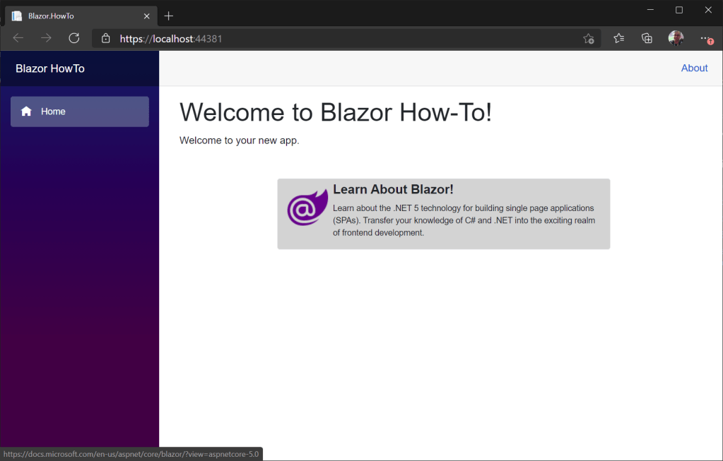
In conclusion, we were able to build a new Blazor component and then consume that component in another page. We will create many new components for our Blazor apps. Complex web UIs should be broken down into small composable components to then compose from smaller modules and be reusable. So it’s important to get used to the steps for creating components.
 DarthPedro's Blog
3 thoughts on “How-To: Create New Blazor Component”