Our first attempt at providing player inventory will be a simple one — and we will expand upon it as we build out the game engine. For this initial system, we are going to use a simple list in the Player class that holds the player’s items.
using System.Collections.Generic;

namespace SimpleRPG.Game.Engine.Models
{
    public class Player
    {
        public string Name { get; set; } = string.Empty;

        public string CharacterClass { get; set; } = string.Empty;

        public int HitPoints { get; set; }

        public int ExperiencePoints { get; set; }

        public int Level { get; set; }

        public int Gold { get; set; }

        public IList<GameItem> Inventory { get; } = new List<GameItem>();
    }
}
PlayerTabs Component
To show the player’s inventory, we are going to create a new component that uses a tab control and scrollable table to show both inventory items and quests. For this lesson, we will only focus on the Inventory tab.
To implement this component, let’s create the PlayerTabs.razor file in the SimpleRPG.Game project and Shared folder. We are going to use the Blazorise <Tabs> component to define the two views that the user can switch between. Let’s review the markup for our PlayerTabs component:
<Tabs SelectedTab="@_selectedTab" Pills="true" SelectedTabChanged="OnSelectedTabChanged">
    <Items>
        <Tab Name="inventory">Inventory</Tab>
        <Tab Name="quests">Quests</Tab>
    </Items>
    <Content>
        <TabPanel Name="inventory">
            <div class="table-wrapper-scroll-y my-custom-scrollbar">
                <Table Bordered="true" Hoverable="true" Narrow="true" Striped="true"
                       Style="background-color: white">
                    <TableHeader>
                        <TableRowCell>Name</TableRowCell>
                        <TableRowCell>Price</TableRowCell>
                    </TableHeader>
                    <TableBody>
                        @foreach (var item in Player.Inventory)
                        {
                        <TableRow>
                            <TableRowCell>@item.Name</TableRowCell>
                            <TableRowCell>@item.Price</TableRowCell>
                        </TableRow>
                        }
                    </TableBody>
                </Table>
            </div>
        </TabPanel>
        <TabPanel Name="quests">
            coming soon...
        </TabPanel>
    </Content>
</Tabs>

@code {
    private string _selectedTab = "inventory";

    [Parameter]
    public Player Player { get; set; } = new Player();

    public void OnSelectedTabChanged(string newTab)
    {
        _selectedTab = newTab;
    }
}
The Tabs component defines the parent, then a list of Items (that represent each Tab along the top — by default). Notice that the Tab has a Name parameter, this name is used to match tab items and tab panels to show the selected TabPanel. Then, its child content is whatever we want to show for that tab… for us its just text: Inventory and Quests.
Next, each TabPanel defines the UI element layout for each tab. In a tab control only one TabPanel is visible at a time. This allows us to build complex UI and only show parts of it to the user at a time. For our Inventory panel, we again create a Blazorise <Table> component with a header and two columns for Item.Name and Item.Price.
If you want a refresher on using the Table component, please review Lesson 2.3.
The @code block does just two things:
- defines a
Playerparameter to allow for databinding by theTableelements to thePlayer.Inventoryproperty. - handles tab switching logic by defining a variable that binds to the currently visible tab and the
SelectedTabChangedevent to switchTabPanelwhen the user clicks a tab.
The tab switching logic isn’t built directly into the Tabs component, so the host component or page must define the behavior.
Scrollable Region in CSS
A special div is added in line #8 to force the table to a specific height and show a scrollbar if the list is larger than the available area. If we did not have a fixed-size, scrollable area, the whole page would continue to grow down and get its own scrollbar. And we don’t want that for our game screen. This div uses the table-wrapper-scroll-y and my-custom-scrollbar CSS classes to define the scrollable region. The code below is added to the /wwwroot/css/app.css file:
.my-custom-scrollbar {
    position: relative;
    height: 25vh;
    overflow: auto;
}

.table-wrapper-scroll-y {
    display: block;
}
This makes the scrollable region 25% of the vertical screen size, and the scrollbar only shows if there is more content than can be shown. Here is what that would looks like:

To dive deeper into CSS and defining your own stylesheet behavior, the W3Schools CSS Tutorial is a great source.
Adding PlayerTabs to MainScreen
First, let’s update the GameSession constructor to start the player off with a simple weapon. We will just give all players a Pointy Stick Weapon.
using SimpleRPG.Game.Engine.Factories;
using SimpleRPG.Game.Engine.Models;

namespace SimpleRPG.Game.Engine.ViewModels
{
    public class GameSession : IGameSession
    {
        private readonly World _currentWorld;

        public Player CurrentPlayer { get; private set; }

        public Location CurrentLocation { get; private set; }

        public MovementUnit Movement { get; private set; }

        public GameSession()
        {
            CurrentPlayer = new Player
            {
                Name = "DarthPedro",
                CharacterClass = "Fighter",
                HitPoints = 10,
                Gold = 1000,
                ExperiencePoints = 0,
                Level = 1
            };

            _currentWorld = WorldFactory.CreateWorld();

            Movement = new MovementUnit(_currentWorld);
            CurrentLocation = Movement.CurrentLocation;

            CurrentPlayer.Inventory.Add(ItemFactory.CreateGameItem(1001));
        }

        public void OnLocationChanged(Location newLocation) =>
            CurrentLocation = newLocation;
    }
}
Then, we need to place the PlayerTabs component in the bottom-left column of the game screen, and pass in the GameSession.CurrentPlayer property as its Player parameter.
@page "/"
@inject IGameSession ViewModel

<Row Margin="Margin.Is0" Style="height: 5vh; min-height: 32px">
    <Column ColumnSize="ColumnSize.Is12" Style="background-color: lightgrey">
        <Heading Size="HeadingSize.Is3">Simple RPG</Heading>
    </Column>
</Row>
<Row Margin="Margin.Is0" Style="height: 60vh">
    <Column ColumnSize="ColumnSize.Is3.OnWidescreen.Is12" Style="background-color: aquamarine">
        <PlayerComponent Player="@ViewModel.CurrentPlayer" />
    </Column>
    <Column ColumnSize="ColumnSize.Is9.OnWidescreen.Is12" Style="background-color: beige">
        <Row Margin="Margin.Is2.OnY">
            <Column ColumnSize="ColumnSize.Is8.OnWidescreen.Is12">
                Game Data
            </Column>
            <Column ColumnSize="ColumnSize.Is4.OnWidescreen.Is12">
                <LocationComponent Location="@ViewModel.CurrentLocation" />
            </Column>
        </Row>
    </Column>
</Row>
<Row Margin="Margin.Is0" Style="height: 33vh">
    <Column ColumnSize="ColumnSize.Is3.OnWidescreen.Is12" Padding="Padding.Is2.OnY"
            Style="background-color: burlywood">
        <PlayerTabs Player="@ViewModel.CurrentPlayer" />
    </Column>
    <Column ColumnSize="ColumnSize.Is9.OnWidescreen.Is12" Style="background-color: lavender">
        <Row Margin="Margin.Is2.OnY">
            <Column ColumnSize="ColumnSize.Is8.OnWidescreen.Is12">
                Combat Controls
            </Column>
            <Column ColumnSize="ColumnSize.Is4.OnWidescreen.Is12">
                <MovementComponent Movement="@ViewModel.Movement" LocationChanged="@ViewModel.OnLocationChanged" />
            </Column>
        </Row>
    </Column>
</Row>
Now we can build our project and run the game again to get the following screen:
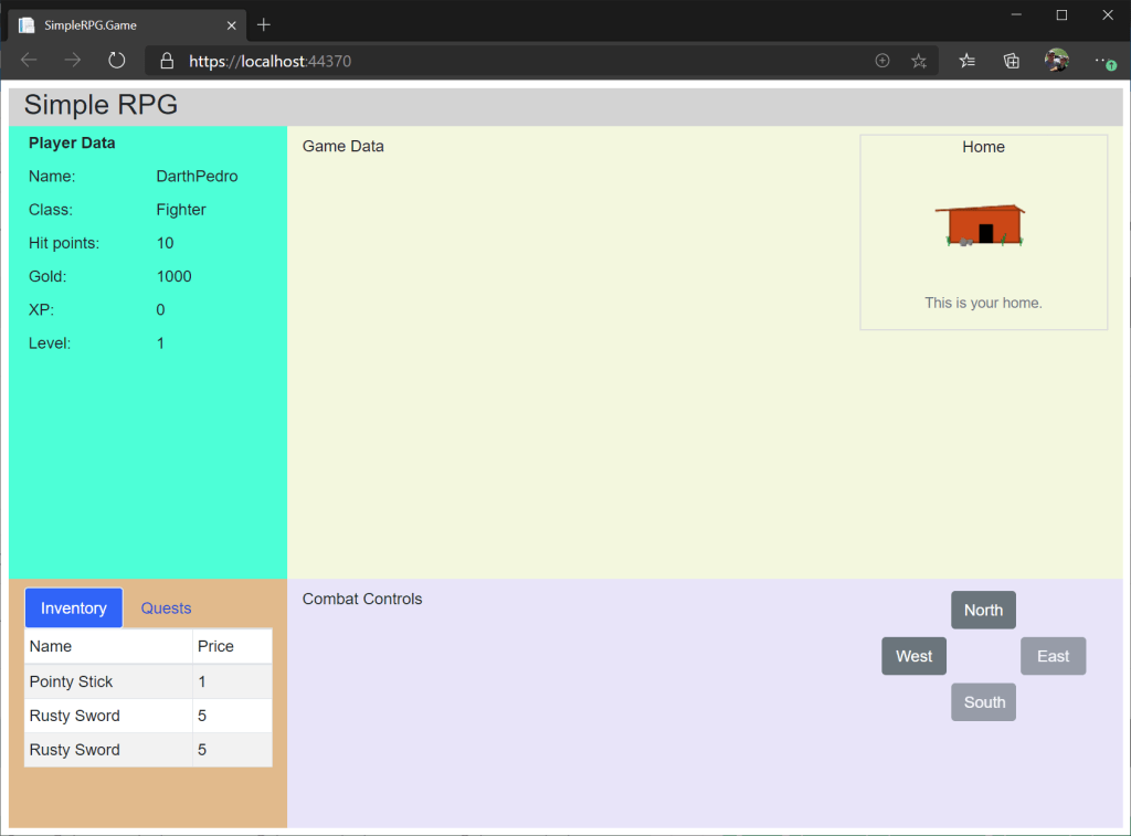
This wraps up the initial code and UI for a simple inventory list. The player can hold a list of game items and the PlayerTabs component updates as items are added and removed. As we move forward with the lessons, we will enhance the inventory further.
 DarthPedro's Blog
One thought on “Lesson 3.2: Initial Player Inventory”