We’ve done a lot of setup to this point. Let’s change gears for a lesson and focus on setting up the basic layout of the game screen. We want to segment the screen up into several areas, which we will do by using the grid concept in Bootstrap CSS.
Updating MainLayout
Our game looks more like a web application (with navigation bars and links and headers) than it looks like a game. We’re going to completely customize the default layout of the screen so that we can develop a custom look and feel.
To start, we’re going to update the MainLayout.razor file. This file is responsible for the shared layout of the application (menus, navigation, header)… aka the chrome of your app. It initially defines a navigation sidebar and header:
@inherits LayoutComponentBase

<div class="sidebar">
    <NavMenu />
</div>

<div class="main">
    <div class="top-row px-4">
        <a href="http://blazor.net" target="_blank" class="ml-md-auto">About</a>
    </div>

    <div class="content px-4">
        @Body
    </div>
</div>
We’re going to remove these trimmings and just take over the entire main area of the page. Let’s replace the code in that file, with the following:
@inherits LayoutComponentBase

<div class="main content px-4">
    @Body
</div>
Much simpler layout… The @Body is a ChildContent property of the LayoutComponentBase class. It is also a RenderFragment, which means that it contains a set of markup that will be rendered upon request. Whatever page the user navigates to gets rendered when the Body property is instantiated. As we can see from the original code, we can place all sorts of shared UI here and leave page specific UI to be rendered with the Body RenderFragment.
Blazorise Layout Components
Blazorise uses <Row> and <Column> components to represent a grid on the page. These are flexible components that resize and move in response to screen size, which makes it easier to create responsive user interfaces (UIs).
To mimic the layout of the original WPF version of the Simple RPG, we are going to rewrite the Index.razor page to the following code:
@page "/"

<Row Style="height: 5vh; min-height: 32px">
    <Column ColumnSize="ColumnSize.Is12" Style="background-color: aliceblue">
        <Heading Size="HeadingSize.Is3">Simple RPG</Heading>
    </Column>
</Row>
<Row Style="height: 60vh">
    <Column ColumnSize="ColumnSize.Is3.OnWidescreen.Is12" Style="background-color: aquamarine">
        Player Data
    </Column>
    <Column ColumnSize="ColumnSize.Is9.OnWidescreen.Is12" Style="background-color: beige">
        Game Data
    </Column>
</Row>
<Row Style="height: 30vh">
    <Column ColumnSize="ColumnSize.Is3.OnWidescreen.Is12" Style="background-color: burlywood">
        Inventory/Quest
    </Column>
    <Column ColumnSize="ColumnSize.Is9.OnWidescreen.Is12" Style="background-color: lavender">
        Combat/Movement Controls
    </Column>
</Row>
Let’s go over the interesting pieces of this new file. The @page directive means that any routing to the root of our app url gets directed to this page, which makes sense since this is our home page. We won’t use much routing in this game, so we’ll leave the deeper discussion of Blazor routing for later.
We repeat several rows and columns, so let’s look at just one in detail:
<Row Style="height: 60vh">: defines a row with a height of 60% of the page’s viewport. This allows us to build UI vertically sized relative to the size of the visible page. More details about viewports.<Column ColumnSize="ColumnSize.Is3.OnWideScreen.Is12" Style="background-color: aquamarine>: This defines a first column that take up 25% of the screen (or 3 out of 12 columns). But it only does so on wide screens. On phones or portrait sizes, it takes up the whole row (Is12 => 12 out of 12 columns).<Column ColumnSize="ColumnSize.Is9.OnWideScreen.Is12" Style="background-color: beige>: This defines a second column that takes up 75% of the screen (or 9 out of 12 columns) on wide screens. But it takes up the whole row on phones or portrait sizes.
The colors are different for each section, so we just put a Style attribute on each section. If there were shared styles, then we would put them into a CSS file and use the Class attribute instead.
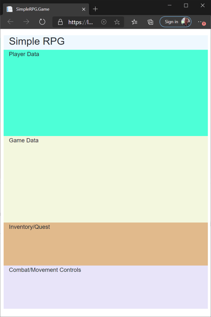
If we build and run our application now, we should see the screen below:

If we resize the browser window, we will see that the boxes resize in response. If we resize to the breakpoint where the window is taller than wider, we will see a different layout. The boxes will stack on one another rather than in a grid. And if we size the width down all of the way, we will see what our game would look like on a phone screen.
If you’ve ever tried to do this type of responsive UI in CSS or Bootstrap, you know there is some CSS and media breakpoint magic happening under the covers. But with Blazorise, it is easy to describe what the layout is at different screen size breakpoints without needing all of the details (for now).
ColumnSize="ColumnSize.Is3.OnWidescreen.Is12" uses the Fluent API construct to chain multiple calls together to build the ColumnSize behavior. That code literally translates to: the column width is 3 columns on wide screens (landscape mode) and 12 columns on narrow screens (portrait mode).
The phone layout probably isn’t perfect. But it’s a good starting point, we can customize it further as we progress through the game development.
There we have it — a custom game screen that lays out differently on multiple window sizes. Let’s commit the code we have at this point.
 DarthPedro's Blog