Starting with version 5, Bootstrap introduced a rich set of SVG-based icons—lightweight, scalable, and perfect for modern web applications. Since the default Blazor WebApp templates already include Bootstrap, integrating these icons is a simple way to enhance your UI with clear, consistent visual elements.
Using icons effectively can make your Blazor apps more intuitive and visually appealing. SVGs are particularly well-suited for this: they’re smaller in size compared to traditional image formats like JPEG or PNG, and they scale cleanly across different screen sizes.
First, we must have a Blazor project. Either open an existing Blazor project, or please follow the steps in the How-To: Create Blazor WASM Project article to create a new one. For this article, we called the project: BlazorHowTo.IconApp.
Then, we need to change the generated Index.html file to the following:
<!DOCTYPE html>
<html lang="en" data-bs-theme="dark">

<head>
    <meta charset="utf-8" />
    <meta name="viewport" content="width=device-width, initial-scale=1.0" />
    <title>Dark-Mode App</title>
    <base href="/" />
    <link href="https://cdn.jsdelivr.net/npm/bootstrap@5.3.0/dist/css/bootstrap.min.css" rel="stylesheet" integrity="sha384-9ndCyUaIbzAi2FUVXJi0CjmCapSmO7SnpJef0486qhLnuZ2cdeRhO02iuK6FUUVM" crossorigin="anonymous">
    <link rel="stylesheet" href="https://cdn.jsdelivr.net/npm/bootstrap-icons@1.11.3/font/bootstrap-icons.min.css">
    <link rel="stylesheet" href="css/app.css" />
    <link rel="icon" type="image/png" href="favicon.png" />
    <link href="DarkModeApp.styles.css" rel="stylesheet" />
</head>

<body>
    <div id="app">
        <svg class="loading-progress">
            <circle r="40%" cx="50%" cy="50%" />
            <circle r="40%" cx="50%" cy="50%" />
        </svg>
        <div class="loading-progress-text"></div>
    </div>

    <div id="blazor-error-ui">
        An unhandled error has occurred.
        <a href="" class="reload">Reload</a>
        <a class="dismiss">🗙</a>
    </div>
    http://_framework/blazor.webassembly.js
    https://cdn.jsdelivr.net/npm/bootstrap@5.3.0/dist/js/bootstrap.bundle.min.js

    <script>
        // Function to set the data-bs-theme attribute on the <html> element
        window.setHtmlTheme = (theme) => {
            document.documentElement.setAttribute("data-bs-theme", theme);
        };
    </script>
</body>

</html>
Looking at line #10, we link in the latest version of Bootstrap Icons (5.3) from their CDN.
Now, we can use the Bootstrap Icons in our application. For the purpose of this article, we will replace the default NavBar icons with more meaningful images. You can search for the supported icons on the Bootstrap Icons site.
Here is the updated NavMenu.razor file:
<div class="top-row ps-3 navbar navbar-dark">
    <div class="container-fluid">
        <a class="navbar-brand" href="">DarkModeApp</a>
        <button title="Navigation menu" class="navbar-toggler" @onclick="ToggleNavMenu">
            <span class="navbar-toggler-icon"></span>
        </button>
    </div>
</div>

<div class="@NavMenuCssClass nav-scrollable" @onclick="ToggleNavMenu">
    <nav class="flex-column">
        <div class="nav-item px-3">
            <NavLink class="nav-link" href="" Match="NavLinkMatch.All">
                <i class="bi bi-house fs-4 ms-1 me-3 mb-4"></i>Home
            </NavLink>
        </div>
        <div class="nav-item px-3">
            <NavLink class="nav-link" href="counter">
                <i class="bi bi-plus-circle fs-4 ms-1 me-3 mb-4"></i>Counter
            </NavLink>
        </div>
        <div class="nav-item px-3">
            <NavLink class="nav-link" href="weather">
                <i class="bi bi-cloud-sun fs-4 ms-1 me-3 mb-4"></i>Weather
            </NavLink>
        </div>
    </nav>
</div>

@code {
    private bool collapseNavMenu = true;

    private string? NavMenuCssClass => collapseNavMenu ? "collapse" : null;

    private void ToggleNavMenu()
    {
        collapseNavMenu = !collapseNavMenu;
    }
}
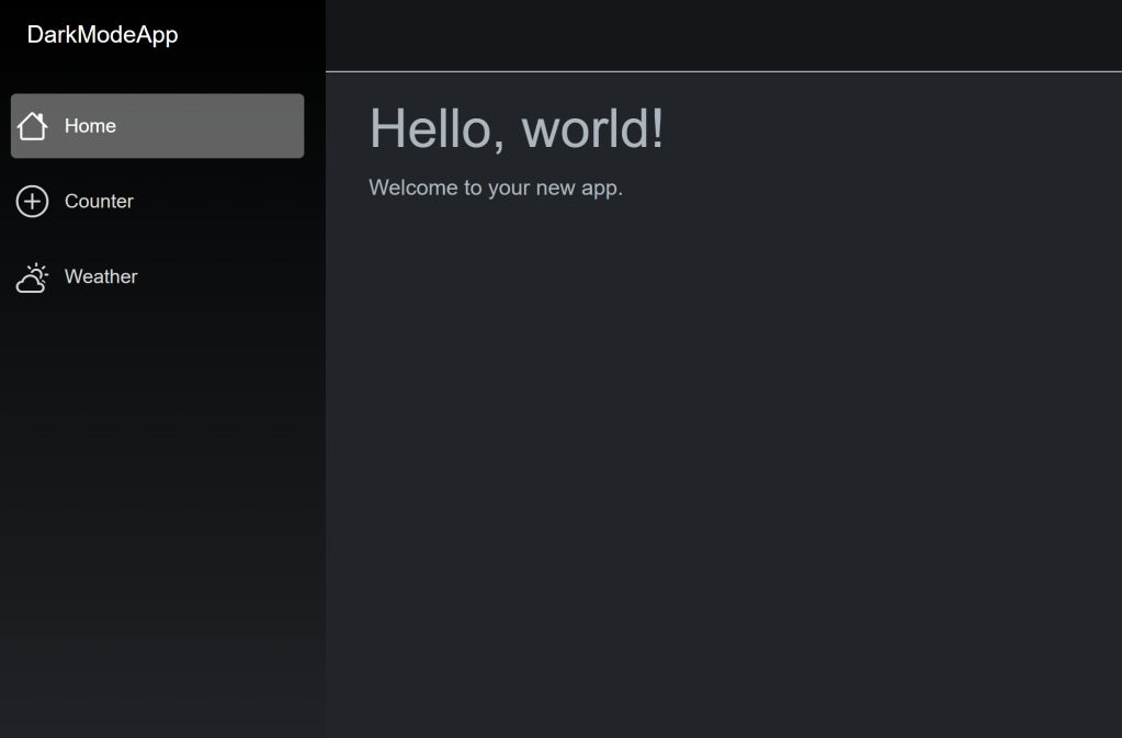
All three existing nav items are changed to use Bootstrap Icons. For example, the Home link uses the bi-house icon.
<i class="bi bi-house fs-4 ms-1 me-3 mb-4"></i>
The margin and font sizing are also Bootstrap css classes to ensure the icons appear in the proper location.
We can then run the Blazor app to see how the new NavMenu looks:
Conclusion
Incorporating Bootstrap Icons into your Blazor applications is a simple, powerful way to enhance your UX without adding unnecessary complexity. With a wide selection of lightweight SVG icons, you can improve the visual clarity, consistency, and user experience of your app – with minimal setup. Whether you’re building a dashboard, form-heavy app, or something entirely custom, great iconography helps communicate intent and brings polish to your design. Give your Blazor app that extra layer of professionalism – one icon at a time.
 DarthPedro's Blog